




Rebranding DARPA – Art Direction, Design, Creative Lead
DARPA (Defense Advanced Research Projects Agency)
Agency Director: Dr. Regina Dugan
Role: Senior Art Director & Lead Creative
Project Focus: Logo Redesign, Brand Guidelines, UX/UI Strategy
DARPA, established in 1958, is the U.S. Department of Defense agency responsible for pioneering emerging technologies for military use. Over the decades, DARPA has been at the forefront of innovation, from the creation of the Internet to advanced AI systems. As the agency evolved, the visual identity that once represented DARPA's groundbreaking work had become dated. Under the leadership of Dr. Regina Dugan, the first female director of DARPA, there was a need for a brand refresh to reflect DARPA’s forward-thinking vision in the modern technological landscape.
DARPA’s original logo and branding, dating back to the late 1950s, no longer communicated the futuristic vision that the agency had embodied. The goal of the rebranding was to develop a cohesive and modern identity that not only respected DARPA's legacy but also projected its innovative leadership in cutting-edge technology. The rebranding had to align with the sensitive and confidential nature of DARPA’s projects, while also being accessible and functional for both internal and external stakeholders.
Objectives
1. Update DARPA’s logo to reflect its modern technological focus while maintaining historical roots.
2. Create comprehensive brand guidelines that define the brand's visual and verbal identity.
3. Redesign the digital experience (UX/UI) to ensure consistency, usability, and adaptability across platforms.
4. Position DARPA as a leader in innovation, while conveying authority, vision, and trustworthiness.
Art Direction Strategy
Logo Redesign
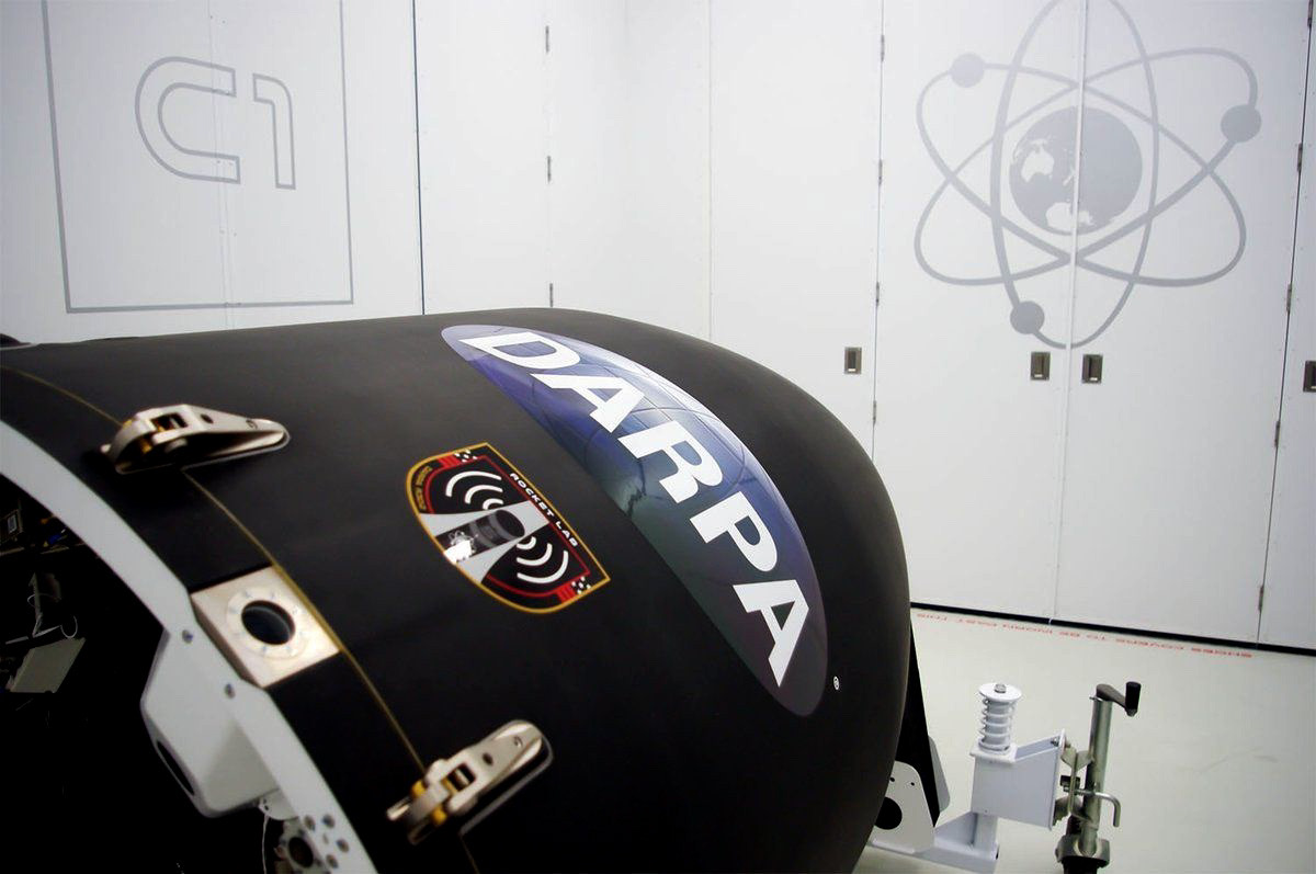
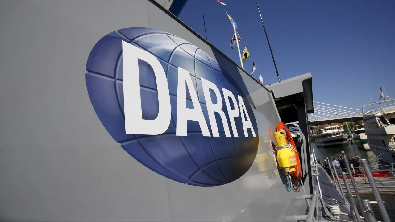
The core of the rebranding effort centered around modernizing the 1958 logo. The original oval-shaped logo, though iconic, felt outdated in a world of sleek and minimal design. Our approach was to evolve the symbol without abandoning its history.
• Conceptual Inspiration: Drawing from DARPA’s mission to “create and prevent strategic surprise, the design was inspired by the concept of transformation, progress, and forward movement.
• Form and Structure: The oval shape was retained as a nod to the legacy logo but was streamlined for modernity. Sharper, angular lines were introduced, symbolizing cutting-edge technology, precision, and forward trajectory. The typography was modernized with a futuristic, sans-serif font that projects confidence and clarity.
• Color Palette: The existing blue and white were enhanced with deeper, richer tones of navy to represent strength, trust, and authority, while introducing subtle metallic accents to evoke the feel of advanced technology and innovation.
Brand Guidelines
A robust set of brand guidelines was developed to ensure consistency across all communications. The guidelines included specifications for logo usage, typography, color systems, imagery, and messaging.
• Logo Usage: Clear rules on how and where the logo should appear, including minimum sizes, appropriate spacing, and variations for different mediums.
• Typography: A bold, clean sans-serif font family was chosen to reflect the modern, forward-thinking nature of the agency. A secondary font was introduced for internal documentation and technical reports.
•. Tone of Voice: DARPA’s messaging was crafted to balance the technical expertise required for its audience with an approachable, forward-looking tone that highlighted innovation and adaptability.
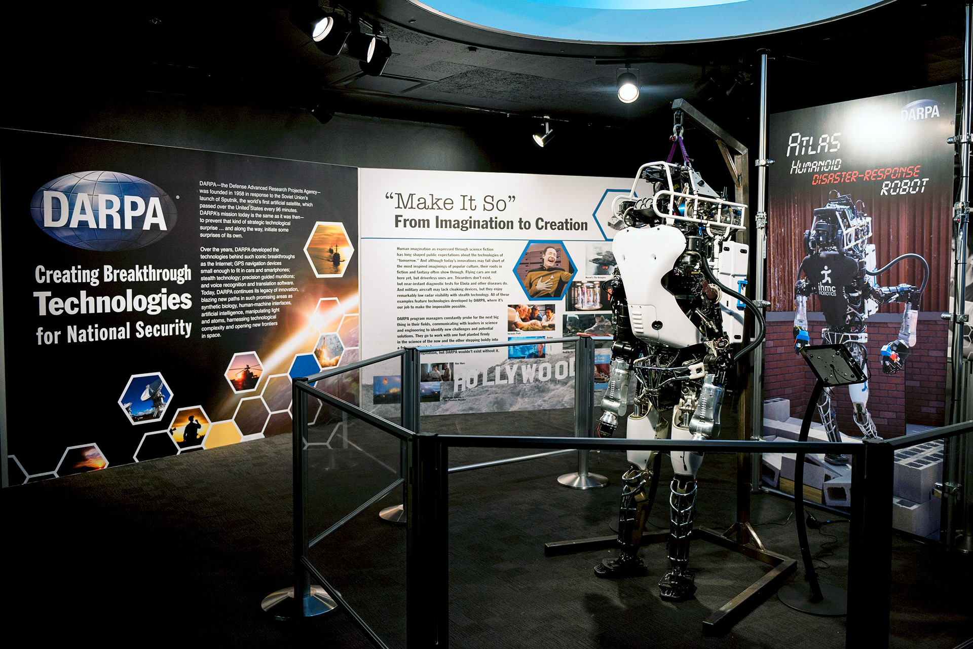
• Imagery and Visual Assets: The visual language incorporated dynamic, high-contrast imagery of futuristic technologies, abstract forms, and conceptual art that illustrated DARPA’s role in pushing the boundaries of possibility.
UX/UI Design
The digital experience had to be as forward-thinking as the technologies DARPA develops. We undertook a complete redesign of DARPA’s website and internal digital platforms to reflect the updated brand identity and improve user engagement.•
• User-Centric Design: We simplified navigation and introduced a clean, minimalist design that emphasized ease of use. The user interface was designed with accessibility in mind, ensuring that all users could interact with DARPA’s content seamlessly.
• Mobile Optimization: DARPA’s new website was built with mobile-first design principles to ensure a seamless experience across devices, keeping the agency’s mobile workforce and tech-savvy audience in mind.
• Data Security Considerations: As a defense agency, DARPA’s digital platforms required heightened security measures. We worked closely with cybersecurity experts to ensure that the UX/UI design met all necessary security protocols without compromising the user experience.
Results
The rebranding was widely praised both internally and externally for effectively capturing DARPA’s vision of innovation, leadership, and technological prowess. The updated visual identity honored the agency’s rich history while projecting a bold future. The new logo and brand guidelines were integrated seamlessly into all communication channels, from digital platforms to print materials, enhancing DARPA’s public image as a cutting-edge research and development agency.
• Enhanced Brand Recognition: The updated logo and branding were successfully deployed across all digital and physical assets, leading to increased brand cohesion and recognition.
• Improved UX/UI: User feedback on the redesigned website noted a significant improvement in navigation, aesthetics, and overall user experience. DARPA’s online presence now reflects the forward-thinking, innovative nature of the agency.
• Internal Adoption: The new brand guidelines were embraced across the organization, creating a unified voice and visual identity for DARPA.
Conclusion
The rebranding of DARPA under the direction of Dr. Regina Dugan was an opportunity to refresh the agency’s visual identity and align it with its visionary goals. Through strategic art direction, design, and execution, we created a modern, cohesive brand that highlights DARPA’s role at the forefront of innovation. The new identity serves as a visual embodiment of DARPA’s mission to transform technological ideas into reality, inspiring trust and confidence in their groundbreaking work.


